
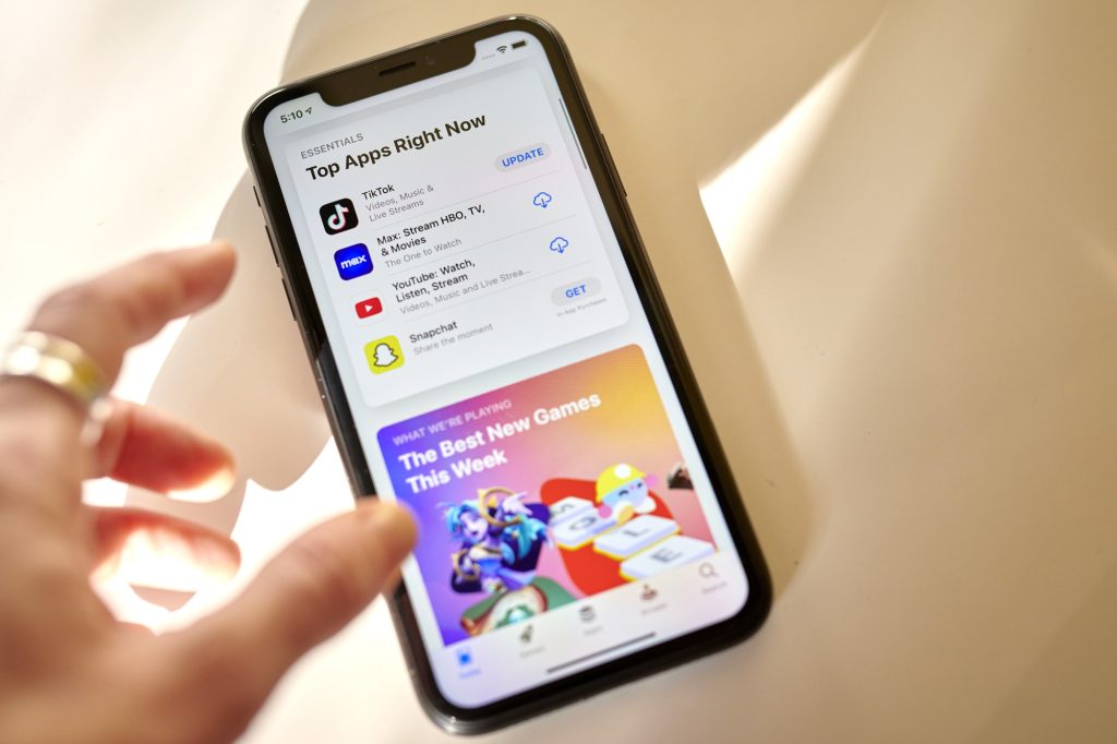
What you need to know for a smooth app approval process
In 2020, nearly 1 million new app submissions and app updates were rejected from the App Store for failing to meet the Apple App Store review guidelines.
In most cases, these incidents were minor or unintentional due to a lack of information on the developer’s part. For instance, Jian, a DevelopPaper user, recently shared that their app submission was delayed because the word ‘Official’ appeared in their app title. The App Store review team interpreted the title as misleading and an attempt to deceive users.
As a mobile developer, knowing how the App Store review process works and the common reasons for delayed App Store review time or outright rejection will help you avoid unnecessary disappointments and revenue loss.
How the App Store review process works
Before any new app or update can be published to the App Store, it must comply with all Apple App Store review guidelines.
According to Apple, the standard App Store review time is less than 24 hours, as “90% of submissions are reviewed in less than 24 hours.” However, if your app fails to meet any of the App Store review guidelines, it may be delayed for longer than the times stated.
Following the Epic Games vs. Apple lawsuit in 2020, information that wasn’t previously public about the App Store review process was revealed. During the trial, Trystan Kosmynka, senior director of marketing/App Review, revealed that 100,000 new submissions are made to the App Store every week.
If all goes well, then there’s the human review stage. Apple employs about 500 human app reviewers who thoroughly examine each app in compliance with the App Store review rules to ensure that none are broken. Afterward, the reviewers make a call to either accept, reject, or delay the approval of the app.
Common reasons for delayed App Store review time and rejections
Apple constantly updates the App Store Review Guidelines to respond to new data privacy challenges and to make sure that the App Store continuously offers a safe experience for users to get apps. The best way to ensure that your app is accepted and remains on the App Store is to keep up with all of the updates.
Among the recent updates, one of the most prominent changes that you should be aware of is that by June 30, 2022, Apple demands that any app that requires account creation must provide an end-to-end pathway for in-app account deletion. (P.S.: The website App Store Review Guidelines History publishes updates or changes made to the App Store review guidelines to make them easier to spot.)
Despite the many guidelines, Apple recently shared the common reasons why apps are rejected or the App Store review time is delayed. These are the checks you should definitely start with.
1- Unfinished or buggy apps
This is one of the major reasons why apps are rejected from the App Store. The App Store is only for complete, fully functional, and usable apps that are ready for distribution. As such, Apple rejects any app that it deems incomplete or buggy.
Make sure your app is 100% ready before submission and that it performs exactly as you claim. Your app could be considered unfinished if it promises certain features it doesn’t deliver on. Additionally, if your app contains placeholder content, broken links, or an incorrect version number, Apple reviewers may consider the app unfinished, which could lead to a rejection or delayed App Store review time.
Apple is also infamously unaccommodating of apps that crash or contain significant bugs. During the review, your app will be put through a series of stress and performance tests designed to break it. So, be sure to perform the same level of testing yourself before submission. Use a mobile CI/CD tool like Bitrise to enforce regression checks at every point, test on real devices, and invite beta testers to go through your app before submitting it to the App Store.
2- Inadequate review information
Apple reviewers will use an app the way a user would, to carefully confirm that everything works as expected and that the app adheres to Apple’s guidelines on privacy, safety, performance, design, and legal compliance. If they encounter any access hindrances or confusion, the app review process may be delayed, and your app could be rejected.
To prevent that, provide all the information needed to use the app. Detailed setup instructions, user account information, or other information about your app should be included in the App Review Information section of App Store Connect.
3- Incomplete or misleading metadata information
The information that users see on your App Store page before installing your app is referred to as metadata. This includes:
- App description
- Screenshots
- Age ratings
- Purchase options
- Privacy information
Apple frowns on metadata that does not accurately portray the app. Over 48,000 apps were rejected by the App Review team in 2020 for undocumented features, while over 150,000 were rejected for containing misleading information in their metadata.
To prevent your app from being flagged down for such reasons, truthfully describe your app’s capabilities and features. Avoid exaggerating your app’s capabilities or portraying your app as something it’s not. Use screenshots that properly portray the app in use, and if your app has in-app purchases, then state it clearly. Also, endeavor to indicate which features of an app are actually free and which ones require a payment or subscription to unlock. Basically, just be transparent.
4- Privacy violations
Apple considers privacy a fundamental right, which is why over 215,000 apps were rejected in 2020 for privacy violations, such as requesting more user data than they required or misusing user data.
Apple requires app developers to publish privacy policies that specify what user data will be collected and how it will be used or shared. The company also requires that app developers only request access to data that’s relevant to app functionality and obtain user consent before any data collection.


Creating landing pages that convert (Guide)
Guide to creating compelling landing pages that convert visitors into paying customers
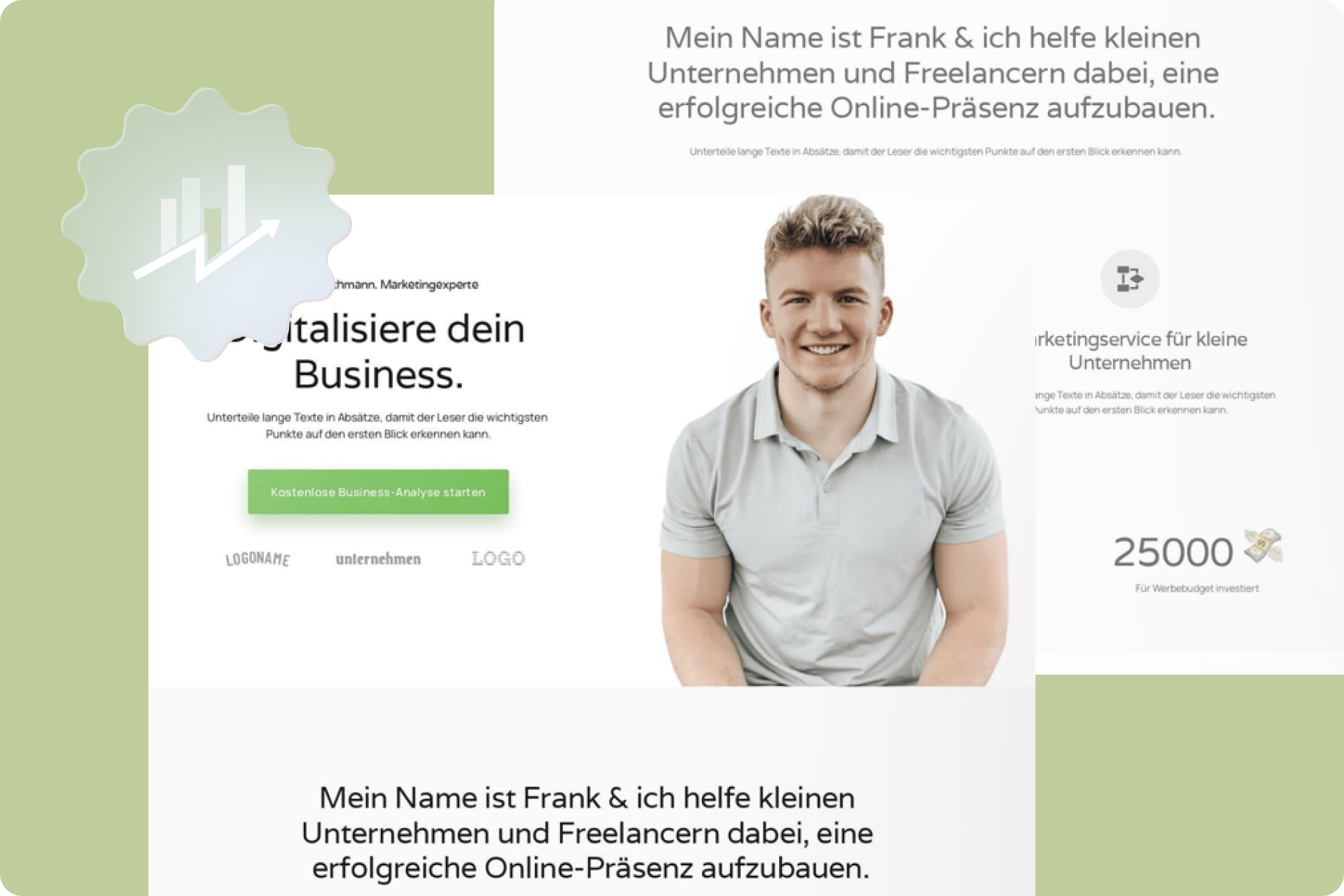
Above the fold
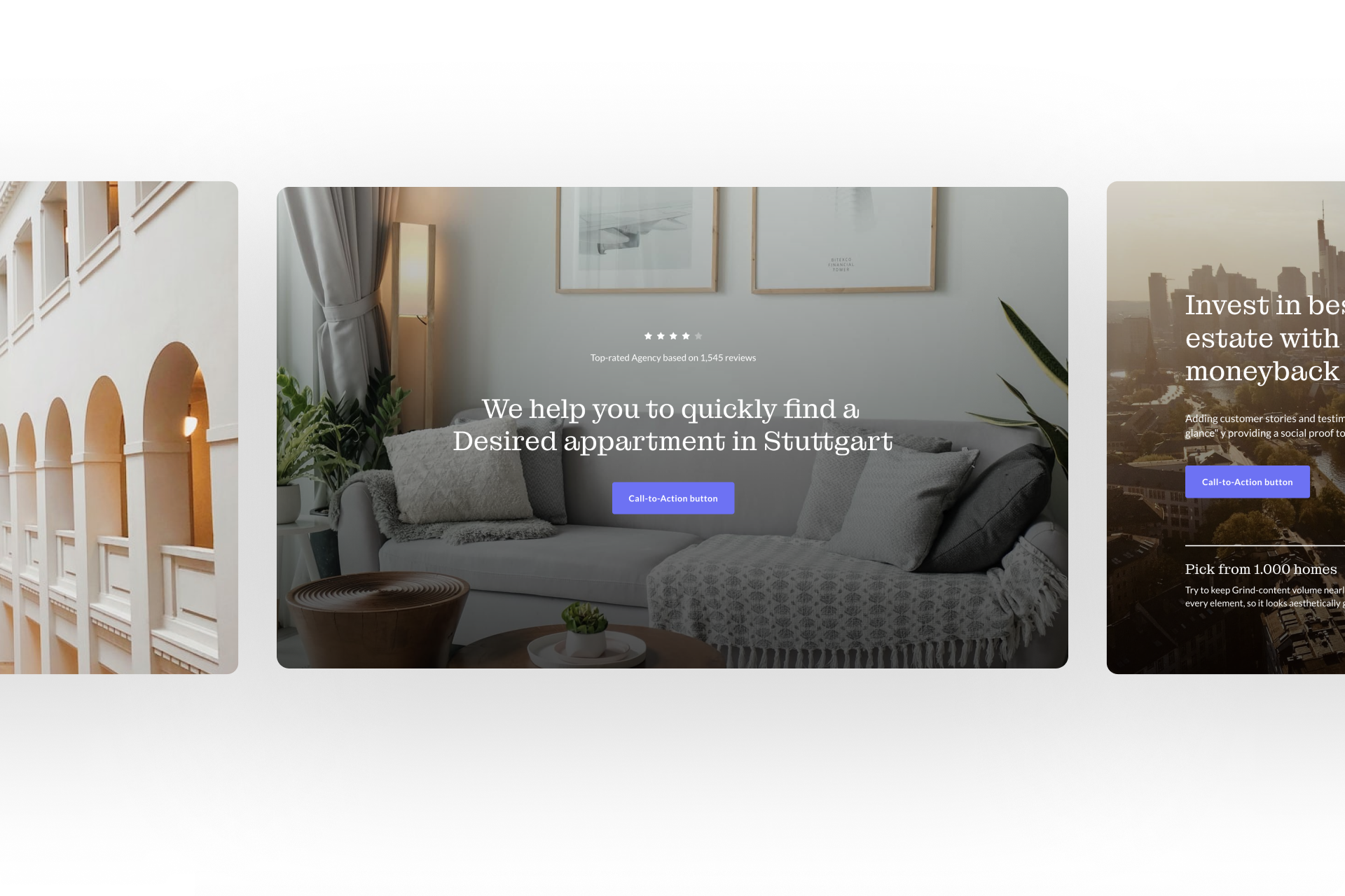
Title:
- Explain what you do: If your product or service is unique, you can use the title to clearly and succinctly explain what you do and the benefits it provides to the customer. Keep it simple and avoid technical jargon to ensure that visitors immediately understand what you are offering.
- Hooks: If your product or service is not unique, you can use a hook, an engaging slogan, to capture visitors’ attention. A hook should address the biggest hurdle or objection of your target audience and demonstrate that you have the solution.
- Dominate your niche: If you operate in a specific niche, you can position yourself as THE solution for that specific problem. Give your statement conviction and show that you are the best solution for this particular target audience.
Subtitle:
- Be precise and specific: The subtitle should be concise and clearly formulated. Avoid overly general statements and instead focus on the specific features or benefits of your product or service.
- Highlight uniqueness: Emphasize in the subtitle what sets your offer apart from others and the added value it provides. Show visitors why your product or service is the best choice.
- Emphasize problem-solving: Clearly illustrate how your offer can solve visitors’ problems or challenges. Show how you fulfill their needs and help them achieve their goals.
Image:
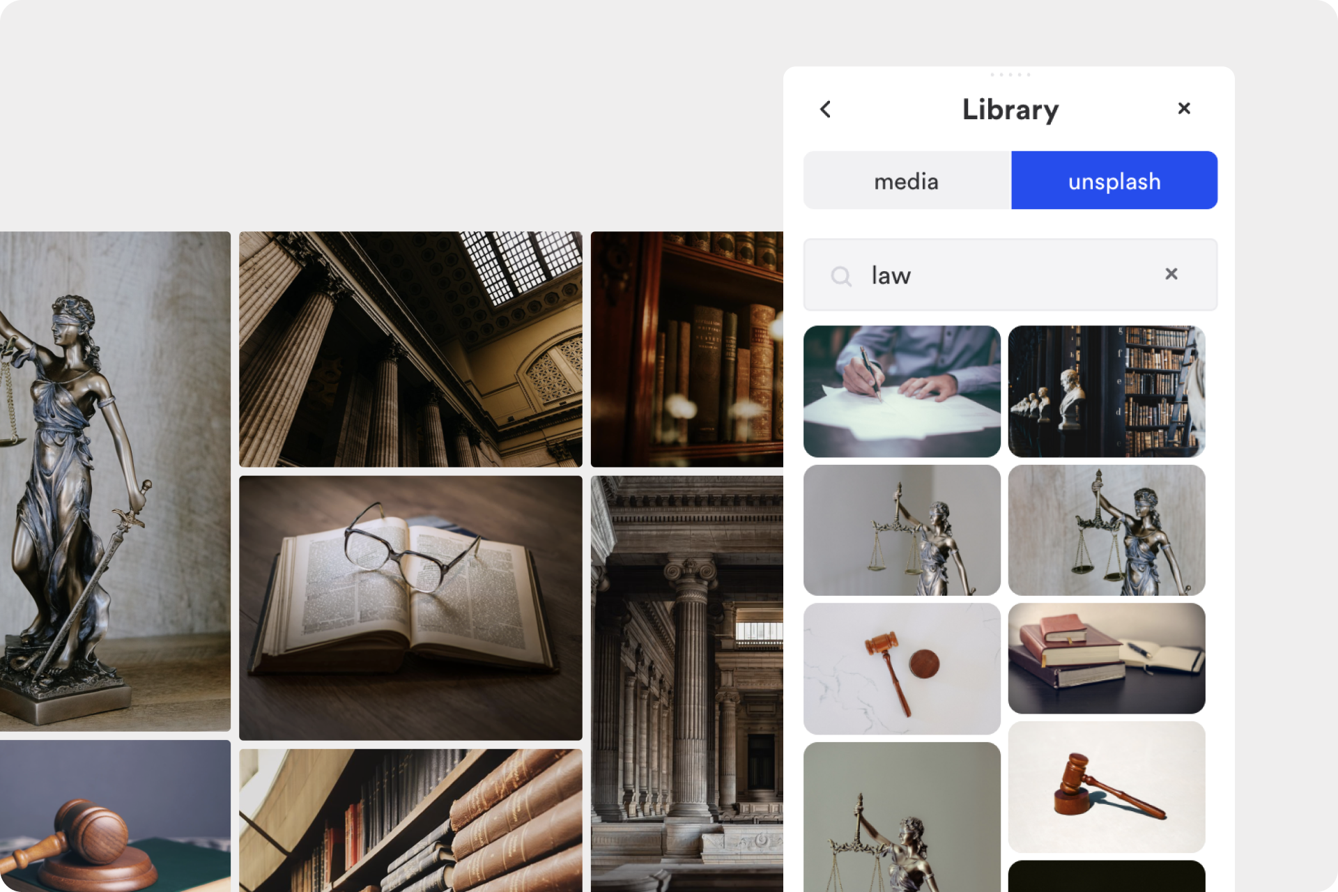
- Realistic representation: Avoid excessive illustrations or generic images. When creating a landing page, show the actual product or the real application of your service. This allows visitors to better visualize how the offering will work in their lives.
- Depict action and benefits: The image should showcase the product or service in action and highlight the benefits that visitors can derive from it. It should emphasize the advantages and results they can expect.
- Appeal to emotions: Use images that evoke emotions and establish a connection with visitors. Emotional reactions can influence purchasing decisions and heighten visitors’ interest.